Quick Guide to Data Visualizations
July 13, 2021
I’ve been mulling over this guide for so long. I wanted to draw specific examples and showcase interesting scenarios. But, the specifics don’t matter. Here are 6 rules to making your data visualizations valuable, useful, and something that would NOT show up in an anime filler episode.
1. Just use a table ~ Sometimes it’s way more efficient to just read a table. Do you only have 2 parameters? Do you have less than 20 data points? Just stick to a table.
2. Make it dense ~ Stick like a million data points into your visualizations. Seriously don’t be afraid. The human brain can handle it. Interesting patterns and intricate stories will start emerging from them.
3. Increase the range ~ Don’t just show one month, show an entire year. Stories are told over time.
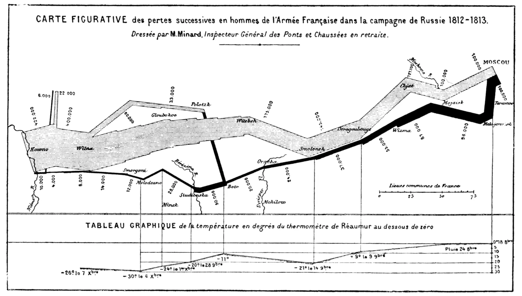
4. Layer parameters ~ How do you take a graph that shows the crime rate in a city over a year to the next level? Layer some weather data over that graph. Now you’ll see that hotter weather correlates with higher crime rates.
If you can’t physically layer it, combine it in different ways. Get creative. This famous graph below has like literally a dozen parameters.
5. Don’t use crappy formats ~ Pie charts and bar graphs suck. Their scaling can be arbitrary, so they end up lying inadvertently. You can’t make them as dense or clean as other formats. Out of all the data visualization types, they use the most cognitive load.
6. Get good at visual design ~ This one takes experience. Good visual design isn’t about making something looking trendy or cool. It’s about knowing what visual details make something more useful while still setting the right mood. It’s a hard thing to do.
You may be thinking, “But there are no rules in design! These must be guidelines right?”. Yeah, they’re guidelines, but let’s pretend they’re rules. Society sucks at data visualization, so we gotta overcorrect.
I learned all of this from reading books by statistician and Yale University professor Edward Tufte.
Home